Power BI: Formatting,Bins&Visuals
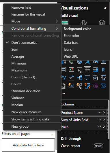
CONDITIONAL FORMATTING
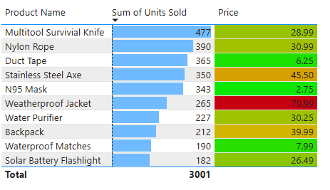
Today, the first concept I learned is conditional formatting. In Power BI tables, we can use colors to make our data visually more meaningful. For instance, when visualizing price values, we can highlight lower-than-average prices in green and higher-than-average prices in red. This approach allows for faster data analysis. Especially with large datasets, visually encoding data is an excellent way to quickly convey important information to users.
When using conditional formatting, if our data is aggregated, an additional option appears: data bars. These bars fill nearly the entire row for higher values in the selected column, while smaller values are represented with shorter bars. This allows for quicker visual comparisons of the data.
In conditional formatting, font color and background color options help visually distinguish the data by coloring either the text or the background. Icons, on the other hand, add symbols instead of colors, enabling faster interpretation.
BINS & LISTS
Grouping data in Power BI is essential because raw data can sometimes appear quite scattered.
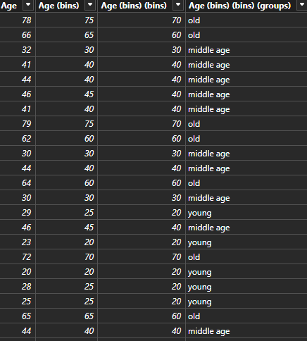
For example, when analyzing a customer's age, instead of displaying every single age individually, defining age ranges makes the data far more meaningful and understandable.
This is where bins come into play! Using bins, data is grouped according to the number of bins selected. For instance, if we choose a bin size of 10, ages 60–69 fall into the 60s group, while 70–79 fall into the 70s group.
Bins are used for numerical data, dividing it into numerical ranges.
If the data is non-numerical, we use lists instead. Lists allow grouping based on categorical data rather than numerical values.
Thus, grouping with bins results in numerical values, while grouping with lists produces text-based results.
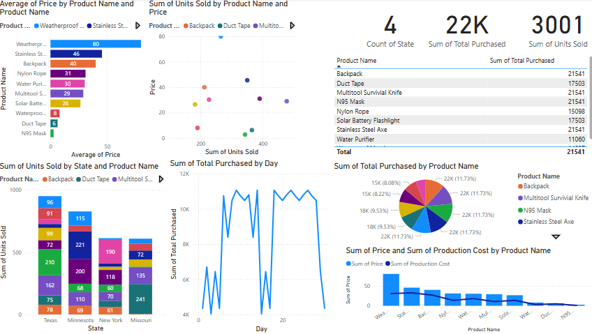
MOST POPULAR POWER BI CHARTS
These include: Stacked Bar Chart, Stacked Column Chart, Line Chart, Scatter Plot, Pie & Donut Chart, Table, and Card visualizations.
Pie charts can also be used effectively when data labels are added, enhancing clarity, though they are generally less preferred than stacked bar or column charts for direct comparison.